Project overview
Just Go Travel Group came to us with a clear problem: they had three tired websites that confused users and failed to deliver on the growing expectations of modern digital travellers. Their customer base, largely older and not especially tech-savvy, needed a booking experience that felt simple, trustworthy, and familiar.
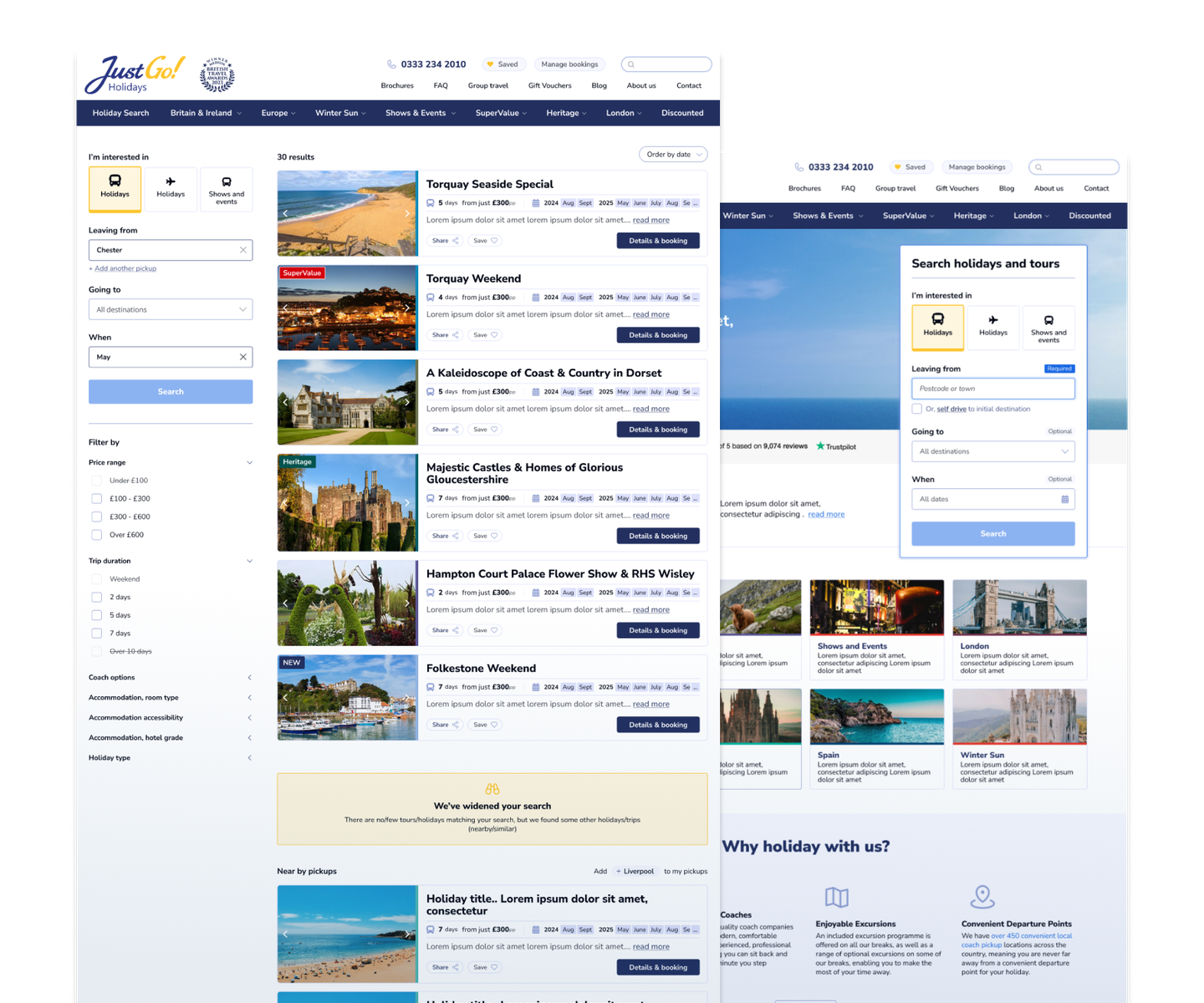
Just Go operates in a highly specialised corner of the travel market, offering location-based coach pickups that deviate from fixed routes. This sets them apart from competitors, as users’ locations often dictate the available travel options. Adding to the complexity, the company also sells flight holidays and specialises in show and event breaks in London, creating a complex booking model that the existing system struggled to support.
The project was about revamping the UX and UI to support a highly custom booking flow while ensuring accessibility, ease of use, and scalability across three separate brands: Just Go Holidays, National Holidays, and Omega Breaks. All of this was achieved without modifying the backend systems.


Project objectives
- Simplify a confusing booking journey throughout all touch points, including pre- and post booking.
- Minimise customer service calls by resolving key UX issues.
- Create a scalable design that works across multiple brands.
- Increase online bookings and reduce bounce and abandonment rates.
- Make the transition from paper brochures to web booking more successful.

The challenges
- Alignment with stakeholders. From the client, to Roeville - the team responsible for the custom dev build who specialise in coach booking software.
- Maintaining a cohesive look and feel while honouring distinct branding and user expectations for each of the three websites.
- The products span coach tours, flight-and-coach combos, and self-drive holidays. Pickup locations influenced which holidays a customer could book, making search logic critical.
- Designing a UX that merges disparate approaches from three different sites into one. This required testing to ensure that customers from each legacy site understood and found the changes intuitive.

The process
Discovery
We kicked things off with a thorough discovery phase, reviewing competitors, combing through user data, and talking to stakeholders from across the business. This surfaced what wasn’t working (broken journeys, overwhelming search options) and what was missing (clear pickup logic, smoother booking flows, and more guidance for confused users).
As part of this phase, we worked with the JG team to "define the challenge." This collaborative effort produced a concise brief that focused the project and secured agreement on internal priorities.
User stories
Next, we worked with stakeholders to define the key user stories across all three brands, mapping out critical pain points in the booking journeys. This became a reference point throughout the project, especially when wrestling with tricky areas like filtering and comparisons.
Wireframing and design
From there, we moved into wireframing. We ensured a feedback-heavy process throughout this phase - keeping conversations open, clear and consistent. It was paramount that the wireframes fully aligned with their objectives and brand vision, which meant several iterations until the client was completely happy.
Then came the design phase. This involved weekly team calls with JustGo and their dev partners Roeville. Close contact was essential here, especially as we headed into pre-build user testing.
User testing
We recruited a handful of real-world users thanks to the Just Go newsletter and carried out surveys to gain deeper insights into their behaviours and expectations. This included:
- Booking history with JGTG
- Patterns in how and when they book, both online and offline
- Which factors matter most when choosing a holiday (e.g. location, pick-up point, dates)
- Issues or frustrations they’ve experienced in the past
- What they expect from the booking process and the holiday itself
From here, we built detailed, clickable prototypes in design tool Figma, to trial key flows like filtering, pickup selection, and search.
Additionally, the testing focused on brand new aspects of the UX that would affect legacy users, and feedback was vital at this stage too, especially given the complexity of the backend booking system.
Final designs
We delivered a complete set of responsive, development-ready designs for Just Go, accompanied by a detailed UI kit and design system to maintain visual consistency and support a smooth, efficient build. Standard deliverables in our process that ensure consistency, scalability, and clarity.
We also remained hands-on in the implementation phase, collaborating closely with the Roeville build team to ensure smooth integration.


The end result
Client feedback was overwhelmingly positive. The final product is a major improvement: a clearer, more intuitive experience built around real user needs, especially for mobile users and first-time visitors.
Most importantly, the foundational UX and design system we developed is scalable, allowing National Holidays and Omega Breaks to align with far less friction. The transition from brochure to web booking is also more successful, helping users adapt to a digital-first approach.
Was it straightforward? No. Was it successful? Absolutely. We’re proud of the clarity and accessibility we brought to a very complex platform. Ultimately we designed a UX that does what it’s supposed to: help real people plan and book holidays without getting lost in the process.
It's an approach we continue to apply when designing travel websites.
The LTM team took the time to understand our business and our customers and to really help us focus on our aims. They delivered a solution that met our brief and supported us through the build with our development partner. James Gambling - Marketing Director